How can you coordinate the colours in your family portraits?
 A great family photograph showcases the bond, love and personalities within your family. But for that picture-perfect, frame-able image, you’re going to want to think a little more about the little details.
Forget the roll-out-of-bed look. You need to start coordinating and planning what you’re each going to wear for your family portraits.
If you’re having a family portrait session with me, I’ll help you with this personally at out style and concept consultation. It’s at this stage that we will go into your wardrobes, and pick out colours and styles that will work for each of you.
But aside from that, let’s look at a few general rules when it comes to dressing for impact in family portrait photography.
Consider the setting of your family portraits:
The colours you wear should take into account where your family photographs are going to be taken.
If you’re having a family portrait shoot in a studio on a white background, then you’ll want to avoid all wearing white clothes that won’t stand out.
Or, if you’re going to be on a beach, make sure what you wear reflects that – you don’t want to be looking odd and out of place.
Here are a few thoughts on different settings and backgrounds:
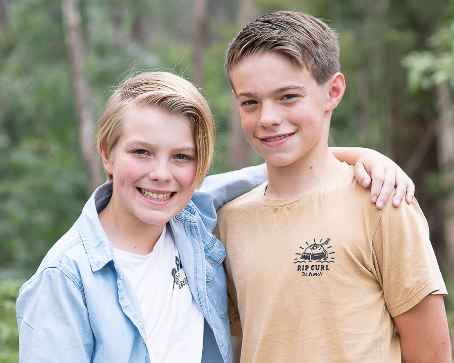
Outside against greenery:
If you’re going to be outdoors amongst nature, select colours and styles that will complement this setting. Colours that stand out against green include whites and earthy tones, pale pinks and blues, or brighter and bold tones like reds.
Outside in an urban or built environment:
I would stick with plain items, and avoid patterns in an urban environment. Unless that urban environment is very plain (such as blocks of concrete that provide little distraction). For a cityscape, or with bricked areas, plain block colours simplify things and ensure you can stand out.

Indoors on a pale or light background:
Of course, darker coloured outfits are going to help your family stand out. You can still incorporate lighter tones, but simple things like jackets, overalls or vests can ensure you don’t disappear too much into the background. I really like a subtle pop of colour on pale backgrounds. Classics like grey, blues and black suit well, as does denim and leather.

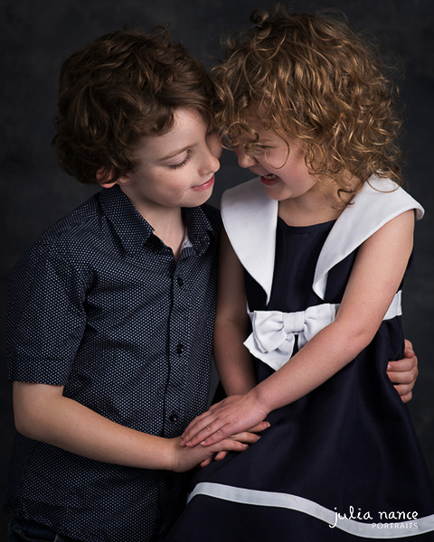
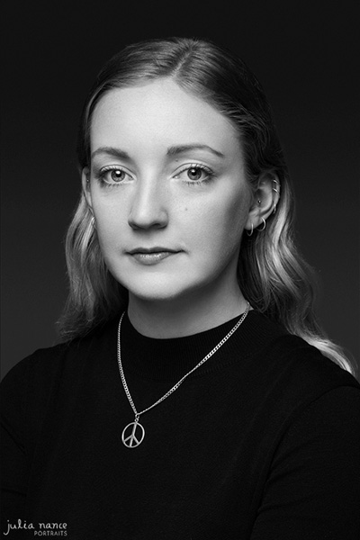
Indoors on a darker background:
The opposite as above. Pastels, pale tones, whites and light greys are safe options on dark backgrounds. You can challenge this though, as it really depends on the overall style of the image you wish to go for. A moody indoor backdrop can work well with medium, darker tones as well to create low-key portraits too (as below).
Coordinating Colour:
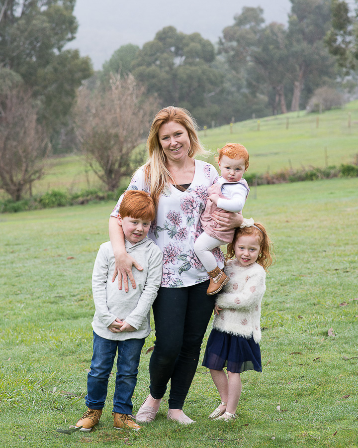 To look great as a family together it can be a nice idea to coordinate your colours so that each of you compliments your group.
I’m not talking about going completely matching, but having a colour palette that works all together, and suits the style you’re after too.
If you’re wanting something casual, light, and ‘lifestyle’, I find paler pastels, whites and earthy tones look amazing amongst nature and greenery.
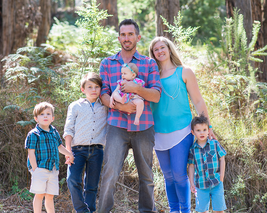
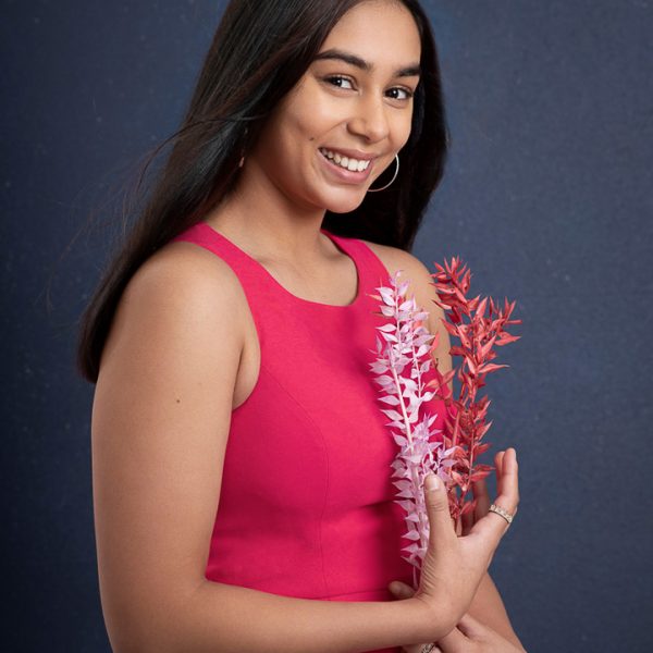
Alternatively, you can pick a standout colour that you love, and each incorporates that colour in one way or another.
This can be through your actual clothing, or in subtle ways through accessories or jewellery. The family below incorporated Mum’s favourite colour, blue, into all of their outfits – it worked really well.
Work with a professional family photographer:
To really perfect your outfits, work closely with a professional family photographer who will guide you through the process from start to finish. A professionals advice will take the stress out of all the decision making, and put you on the right track to ensure your family portraits look amazing!
If you want to learn more about what we do, check out our experience page!
Comments are closed.
